KATHLEEN KENNEY
UX DESIGN + RESEARCH
Situation
PBS had a nostalgic place in many hearts, but its brand wasn’t consistent across all of its platforms.
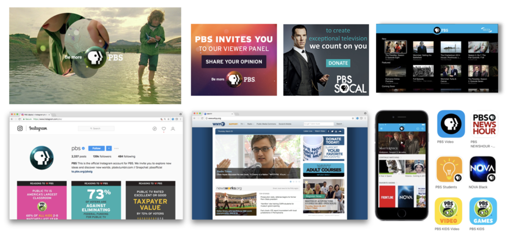
PBS needed a brand for a new era, where content is viewed on infinite device types and sizes.
Task
After the branding agency, Lippencott, created the initial logo and brand strategy it was up to the PBS marketing and digital teams to craft a design system that would work for all platforms and member stations.
Action
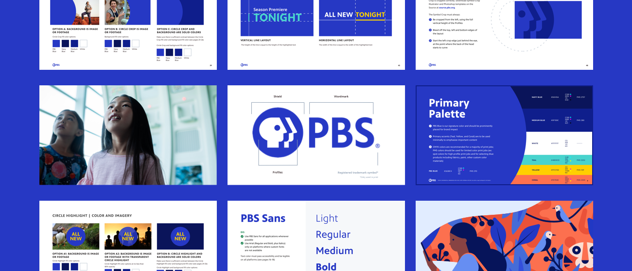
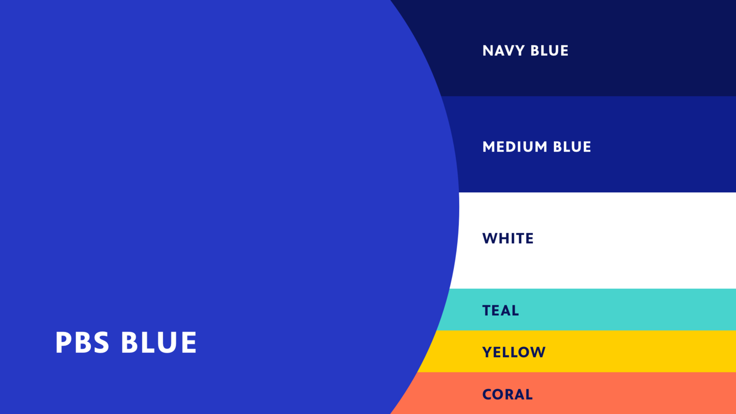
As the digital design director of PBS, Kathleen worked with the team to ensure the colors passed contrast accessibility requirements.
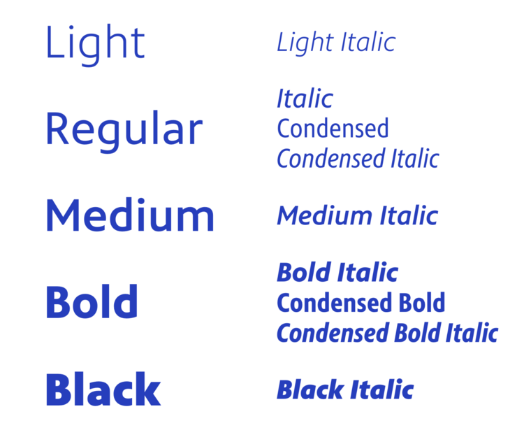
She also worked closely with Monotype to ensure the new custom font, PBS Sans, was as readable as possible at all sizes and widths.
Nathaniel Howe Studios provided a number of options for on-air motion graphics. The digital design team worked closely with him and his team to determine how what they came up with could translate to other more controlled environments like the mobile app and OTT.
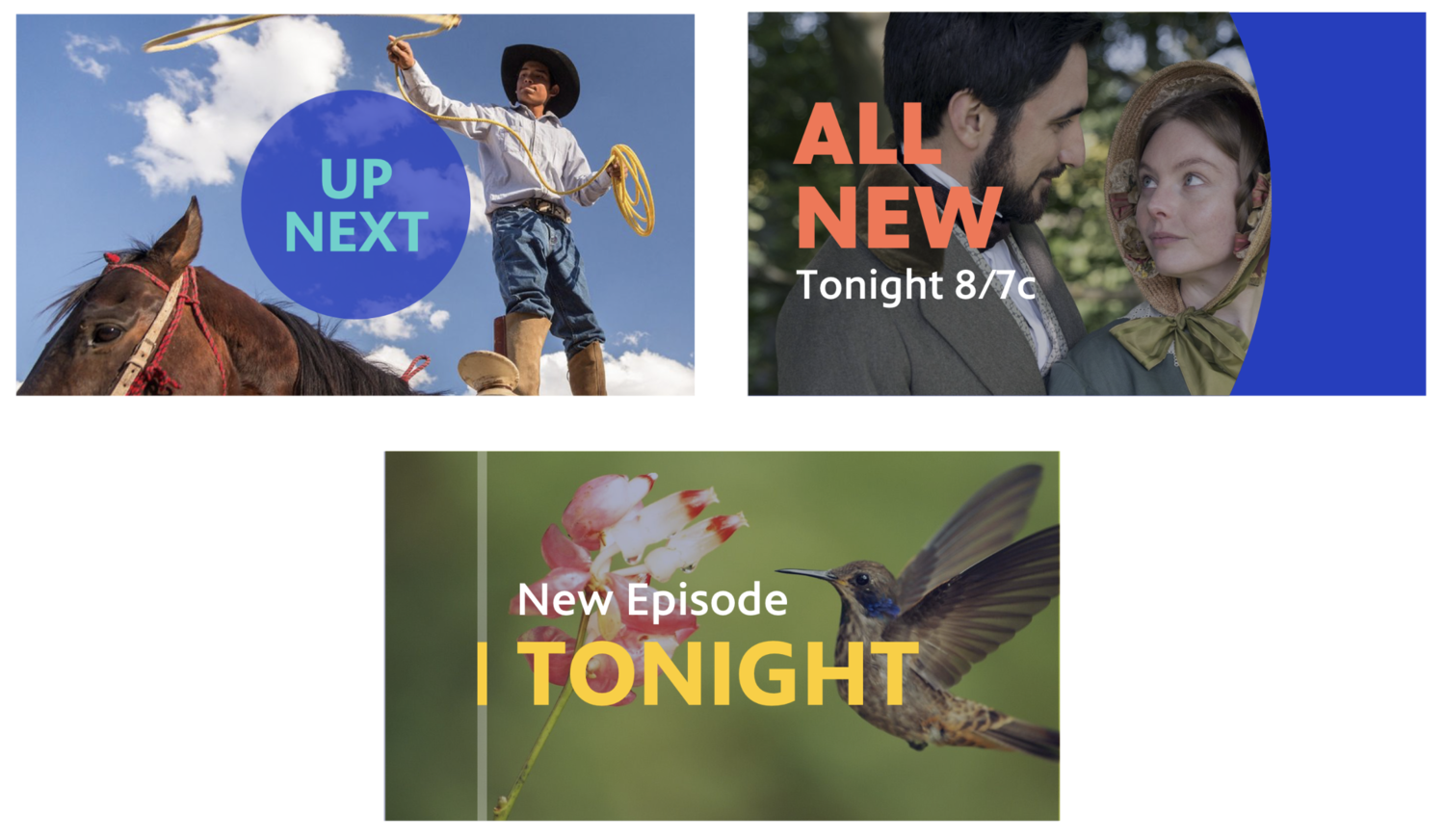
The digital design and marketing teams also worked closely with Evolve Studios to ensure new brand imagery would work for all possible scenarios like narrow widths or large screens. We also made sure all different audiences and environments were represented while maintaining a sense of wonder and excitement.

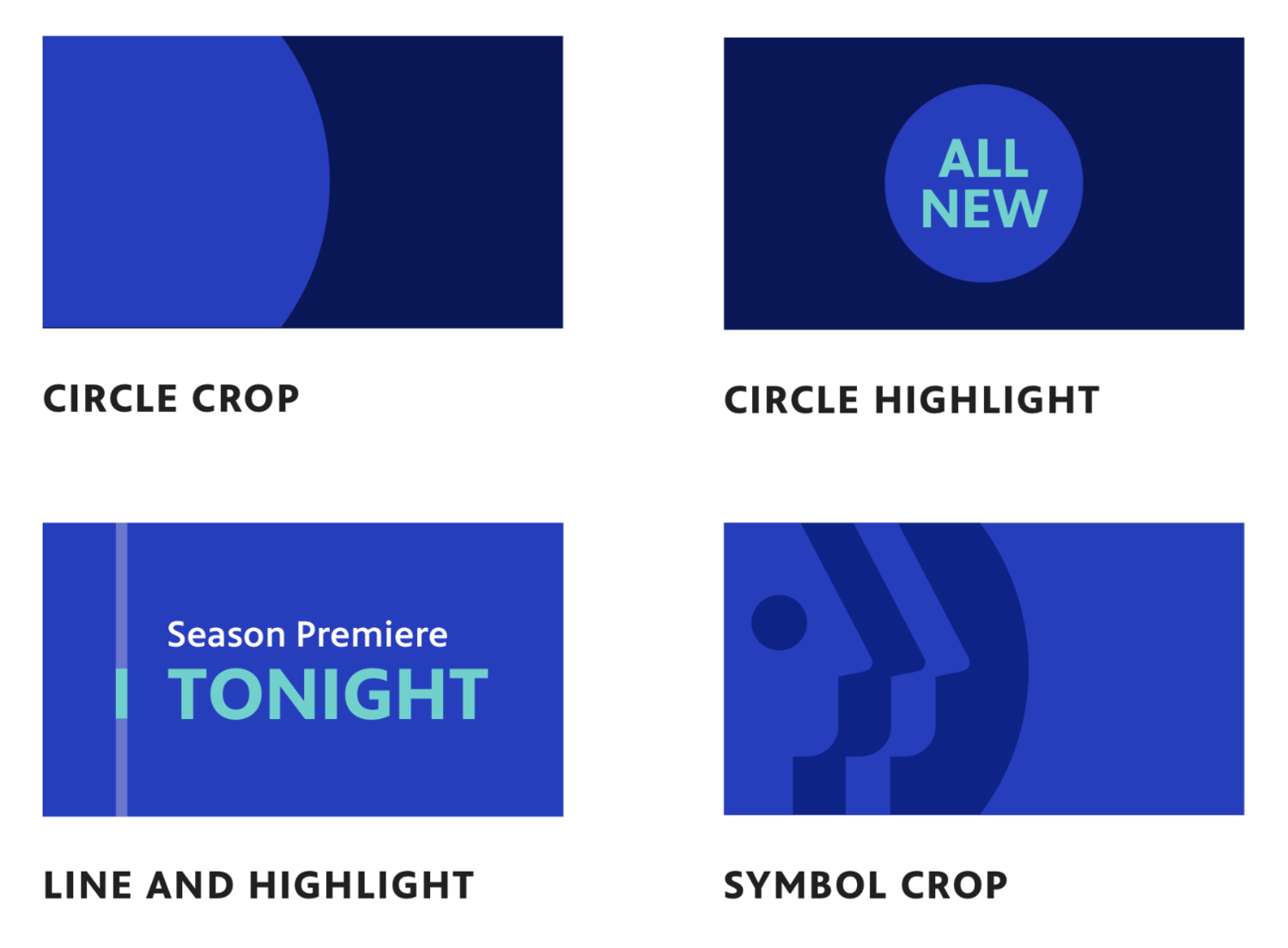
The new PBS logo was more round than the original, so Kathleen helped choose an illustrator that incorporated a lot of round and flat elements to create a world beyond photographs that would work well across PBS’s media. Jerome Masi created a set of 20 brand illustrations that represented all types of people of varying ethnicities and abilities.

Result
The digital design team worked with all these moving parts to create a modern design system that would appeal to PBS’s varying audiences while ensuring the content was the star.
Over 70% of PBS member stations have adopted this new identity.